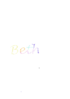
This is the watercolour typography that I did using Adobe Photoshop and the video above. I did this to experiment a different way of doing watercolour typography, after using watercolour paints and paper.
Here I tried to blend colours together to create my name. I decided that the best idea was to use colours that blend into each other; yellow; orange; pink; light blue; light purple; dark purple. I think that this has been very successful and one reason for this is due to the fact that i ensured i used the same 'plae' shade of each colour.
Although it was a success, I think that it could have been better if I had made the word larger, longer and bolder.
No comments:
Post a Comment