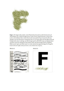
To begin with I tried to create the letter 'B' using the grass effect. However this was an unsuccessful experiment due to the fact that the letter was to round in some places, therefore I was unable to use the grass to shape the letter, as the grass came out in straight lines rather than curved. As a result I thought deeply about the outcome and decided to form the letter 'M' instead which I knew would turn out much better as it only consists of straight lines. I think that this experiment could have looked a lot better if I erased all of the gaps between each line in the letter, this would have enabled us to completely visualize what the letter is.
Friday, 5 October 2012
Furry Font
To begin with I tried to create the letter 'B' using the grass effect. However this was an unsuccessful experiment due to the fact that the letter was to round in some places, therefore I was unable to use the grass to shape the letter, as the grass came out in straight lines rather than curved. As a result I thought deeply about the outcome and decided to form the letter 'M' instead which I knew would turn out much better as it only consists of straight lines. I think that this experiment could have looked a lot better if I erased all of the gaps between each line in the letter, this would have enabled us to completely visualize what the letter is.
Subscribe to:
Post Comments (Atom)


No comments:
Post a Comment