Monday, 26 November 2012

Henrik Bonnevier


Context:
This picture was done by a man named Henrik Bonnevier, born in 1972 who at first aspired to be a skiing photographer and is now a photographer that managed to create a CD cover, which he did not dream of doing. I believe that this picture is something you'd find in a magazine, for example: Vogue magazine. This is due to the fact that Henrik Bonnevier is clearly advertising one of the objects in the picture: Chanel perfume. The fact that he is advertising a perfume shows that the picture has a social context. 

Meaning:
I think that the theme of this picture is fashion and music. This is because he has used a variety of fashionable objects; a purse (which I think is the main focus); jewelery; and a shoe, as well as three pianos. The reason why I think that the main focus is the purse is because the Prada badge/logo is clearly shown, therefore that must be the brand Henrik is advertising. 

Aesthetics:
Henrik has used two very vibrant colours; red and blue which both stand out from each other. I think that this technique makes the image very eye catching. Just like Natsko Seki, Andrea Bricco and Rene Magritte, Henrik has created a surreal theme by playing with the size of the objects and making each object either smaller or bigger than the real life size version. He has done this with every object, except the purse that's being advertised. I think that he used a life size version of the purse because it's the main focus of the picture, therefore he allowed it to look large compared to some of the objects. 

 I have also noticed that the compostition of the objects seems very random, that could have possibly been done on purpose which make sthe image look very interesting. He has clearly thought about the colours he uses as they are both very bold and vibrant which creates a 'striking' effect.

Personal Response:
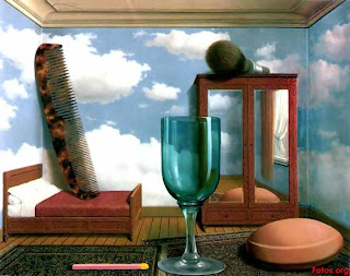
I think that this picture is visually attractive due to the use of bright colour, random composition and glossy effect on the objects. I think that the colours used can allow the person looking at the picture to feel very energetic due to the fact that they are very bright/vibrant. When I first saw it, it reminded me of a surrealist picture that Rene Magritte made due to the different sizes of objects that were unrealistic.

The picture by Rene Magritte:

Andrea Bricco In-depth Analysis


Context:
This picture was created and taken by Andrea Bricco, who is a photographer that grew up in Westconsin where her family owned a restaurant. I believe that her family owning a restaurant has a link to her main theme of photography; food. 

Meaning:
Andrea focuses on lighting as in the majority of her pictures, she avoids creating shadows which I think is done by using an overhead light. In this picture she has used food, which she does in most of her pictures, therefore she focuses on using everyday objects. 

Aesthetic: 
I like the way she creates images with food on a plate, especially how they look like landscapes. The fact that she has created a landscape image proves that she has concentrated and thought carefully on the composition of each object. Also, in other pictures for example: 


she has used illustrations using chalk. I think that using this technique is clever because when I first saw the picture I didn't know what food she had used, I then further observed the image and furthered my understanding of the picture and what food was used by looking at the drawing was. I believe that the drawing is a simple visualisation of the object/food she used. 

Personal Response:
The first picture that I have analysed reminds me of art work done by Rene Magritte and Natsko Seki. This is because Andrea has created a surrealist type of picture like Rene and Natsko have done. Andrea's picture seems surreal because the image she created is not actually realistic as she has used food to 'make' different things; a snow man, snow and the trees. 


Sunday, 25 November 2012

Rene Magritte In-depth Analysis


Context: 
Magritte was a Belgian surrealist artist who became well known for his 'thought provoking' images. Originally he designed wallpapers, ads and posters, but he started painting after he recieved a contract from an art gallery. The purpose of his art was to allow the public to have a different view on things in life. He usually did this by placing floating objects in front of the face, and painted objects in unexpected contexts.

Personal Response: 
Rene Magritte has inspired me as my theme is dreams which relates to his theme of art; surrealism. I know this because he displays pictures in very unusual ways that would not be seen in real life. For example this image on the right; Personal Values.

Meaning:
I would associate this piece of work with the genre of 'conceptual art'. This is because the layout of them picture (the way the train is coming out of the wall) makes it seem as if it has a meaning. One meaning that it could have is 'time goes by'. This is because it is placed underneath a clock. I think that this work has a theme; surrealism. This is because when I researched Rene Magrittes surrealism art, I found this picture. The title: Time Transfixed gives me the idea that the train and clock symbolise something together.

Aesthetic:
I think that this work was done as a painting which makes it even more interesting as the shadows are clearly shown and all of the outlines of each shape are very sharp. 

Natsko Seki In-depth Analysis


Context:
Natsko Seki is a modern illustrator who was born in 1976 and grew up in Tokyo. She traveled to Brighton to study illustration and now works on a wide range of commissions, world wide. Natsko Seki's work is mainly influenced by the different architecture she sees wherever she is travelling, she collages pictures of her friends and family from photo albums as she believes that her work should be personal. This picture is a collage. I know this because she has stuck pictures of trees, giraffes and an elephant.

Meaning:
The genre of art that I would associate this picture with is landscape and I would say that the only theme is surrealism due to the use of the large elephants and giraffes in an open area with people playing. 

Aesthetic: 
I like the way she has used a variety of colours towards the top of the picture,for the same image; a tree. It looks as if she has used tissue paper for the trees which make the picture look very creative as she has also drawn and stuck pictures onto it. 

Personal Response:
I have selected this picture to analyse because I appreciate the use of surrealism which relates to another artists art work; Rene Magritte who also does surrealism. I also like the way that she hasn't included colour everywhere in the picture, but where she uses colour, it is mostly bright. Lastly, I love the way that she has ordered the colours at the top of the page, becasue it seems that as you go along horizontally the colours blend into each other. 


The landscape picture I made after being inspired by Natsko Seki:

Matthew Midgley In-depth Analysis


Context:
This piece was made by Matthew Midgely who does the same thing for a living as Georgina Luck does; freelance illustrating. He graduated from college in 1992 and is now illustrating in West Yorkshire. He develops his style continuously by drawing in a sketch book, while being influenced by other contempary illustrators that focus on the urban life.

This picture was done on November 3rd 2012 to keep an account of what he ate that day. I have chosen this picture to analyse because I am fond of the simplisity of the layout of each image. This simple style has influenced me to draw each of my Matthew Midgely inspired pictures on a seperate page each with no in-depth thought of the layout for each page.

Meaning:
To further my understanding of the purpose of the image I looked at what he has to say about the picture on this website: http://matthewmidgley.wordpress.com/. On the website he clearly states that it is a picture of the breakfast he had that day as he said: "For breakfast I thought I’d try a bit more of a minimalist style. Especially as this was the first morning I’d felt like anything for substantial than tea! I just wanted to tuck in!'' The genre of art that I would associate this picture with is illustration because it is presenting to us what he ate, therefore the subject of the work would be; breakfast.

Aesthetic:
For this picture he has used a biro pen for the outline and detail of each object and waterproof pens to add colour. This is his explanation for the use of materials: 'Black ink gives a crisp, defined edge to my drawing work. Once initial outlines and detailing is complete I add watercolour wash'. 

Personal Response: 
I have selected this picture to analyse because it has inspired me to draw to some pictures in the same style. However I decided to use different materials; a Fine Liner pen, colouring in pencils, and a black watercolour paint. I made this decision because I wanted to be able to visualise the comparison between the different materials. I think that the use of biro pens in Matthew's pictures creates a better effect, like Matthew said, it gives it a 'crisp' defined edge. Whereas the Fine Liner Pen that I used gives my pictures a softer effect. 


A picture I drew after being inspired by Matthew Midgely


 I found this picture that was drawn and painted by Lynne Chapman and decided to put it on my blog because it reminds me of the work done by Matthew Midgley. this is due to the concept of food used, and the techniques/ equipment used to colour in the picture. I can clearly see that she has used a range of watercolour paints to colour the image in, just like Matthew Midgely does. I like the way that she has decided to use a range of colours, giving each food item a contrast in colours, which makes the drawing seem more realistic.


Georgina Luck In-depth Analysis


The picture I made after being inspired by Georgina's picture on the right
Context:
This piece of art was made by Georgina Luck. In 2006 she graduated from Bristol School of Art. She is now a contempary freelance illustrator who has had a wide range of clients; Marks & Spencer, Friends Of The Earth, Malo Media and Parragon. Her art includes various editorial and publishing commissions, as well as inspirations of food, packaging and everyday objects.

This painting has been made using ink which is one reason as to why I have chosen to analyse this picture; Georgina has inspired me to do a painting of a ketchup bottle using the same material (ink) and technique (splashing the ink onto the picture).

Meaning:
I would associate this picture with the theme of 'Everyday Objects'. This is because the tomato ketchup itself is a food substance that can be used everyday with other foods. I believe that Georgina Luck was simply inspired by the ketchup bottle to paint this.

Aesthetic:
By looking at the painting I can see that she has used a pencil to draw the outline and labels on the product. I like the way that she has sketched the picture onto the paper rather than drawing a perfect image with no mistakes; this adds to the messy effect created with the ink. As I have said before, she has used ink to fill in the picture. She has splashed red ink and possibly dabbed it in slightly with tissue or a paint brush to show the actual tomato ketchup. Georgina has then used a paint brush to paint the different sections on the lable. I think she decided to do this because it would have been difficult to splash ink onto the smaller sections. It also seems as if she has decided to carefully paint the important sections of the product; the labels.

Personal Response:
I have selected this picture to analyse because this picture in particular has inspired me to do a painting of a tomato ketchup bottle using ink to add colour. I thought carefully about the way I applied the red ink to the picture as I wanted it to have the same type of 'tomato explosion' effect as Georgina created. I love the way she has selected those colours in particular because I believe that they are the correct shades to resemble the actual product.

The drawings I did after being inspired by Georgina's technique of drawing (drawing the outlines with a Fine Liner pen:


Thursday, 22 November 2012

New Project; Magazines


Evaluation


1. Write an explanation of your brief: What did you have to do? How did you come up with the ideas for this project?
Throughout the course of the project I researched and analysed different types of typography. We used various equipment to do these experiments; computers; Adobe photoshop and illustrator, food, paint, ink, thread, flowers, pens and pencils. I then thought of a technique to use to apply to my t-shirt using my chosen phrase; 'Live Laugh Love'. To present my ideas and to help me think of what I wanted my final project to look like, I created a mood board and t-shirt designs. 

2. Write about the creative 'journey' of the project: How did you project and ideas evolve from start to finish through experimentation and research?
On my creative journey I had to figure out what technique (heat transfer or bleaching) I wanted to use to display the phrase : 'Live Laugh Love'. Eventually I decided to use the heat transfer technique to apply to different pieces; 'Live' and 'Laugh' which I wrote on the computer using Adobe Photoshop, and 'Love' which is a picture that I made using a Samsung digital camera. Throughout this journey as I gathered images and placed them on mood boards, I also created a mood board in my sketchbook and drew out some ideas of my final design idea. 

3. Who inspired your final outcomes?
Tien Min Liao and her use of hands presenting a type of typography is what inspired my final outcome. I think it was very creative for him to 'make' letters using fingers, arms and hands and paint. So I decided to do the same type of thing. However, rather than directly using people's hands and paint, I used their hand's shadows on the concrete which I think looked very interesting as the letters made are obvious as to what they are. 

An example of Tien Min Liao's typography: 


4. What saying or expression did you use? What technique did you use? Was there a link between your materials and the words used? What was it?
The phrase that I used was: 'Live Laugh Love'. To write the words 'Live' and 'Laugh' I used a font on photoshop called 'apple chancery' which is an italic font. Whereas to apply the word 'Love' I used a typography technique. I did this by using my friends hands and positioning their fingers to create the letters. They then placed their fingers high above the ground, blocking the sun light so that I could take a picture of the shadows.  

5. What do you think you have done well? What has worked? Are you happy with your final outcome?
I am very pleased with my final outcome because it looks exactly as I wanted it to. When I thought of the idea I was unsure if the picture and texts would go together. However, If I had a chance to change it I would use a darker colour for the text; ' Live Laugh'. 

6. What do you think you could have improved in your final outcome? There will be something - nobody is perfect!
If I could make an improvement on my final outcome, I would simply change the shade of pink I used for the text placed at the top. This is because I think it would allow the design to look more attractive. 

7. Conclusion: Overall how did you find the project? Would you like to complete more typographic work in the future?
Overall I found the whole project inspiring, creative and enjoyed as i discovered and experimented with different typography types. I will continue to do more typographic experiments in the future.  

Saturday, 17 November 2012

Typography Checklist

WEEK ONE
 

Setting up a Blog

WEEK TWO
 

Hand Drawn Typography: Dry Mediums (sketchbook)
Blogging: Uploading hand drawn type (blog post)
Hand Drawn Typography: Wet Mediums (sketchbook)
 

Homework
 

Documenting your hand drawn typography onto your blog - including in-depth analysis of the work of Hennie Haworth and James Hancock (blog post) see lesson post for full details.

WEEK THREE
 

Watercolour Typography (blog post/sketchbook)
M&M Paris Typography (blog post/sketchbook)
Kinetic Typography (blog post/sketchbook)


WEEK FOUR


Experimental Type: Furry Font/Pin & Thread (blog post)
Experimental Type: Object Typography/Vladimir Koncar (blog post)
Experimental Type: Food Fonts/Ed Rushca (blog post)


WEEK FIVE

Oscar Wilson (blog post)
Hand Drawn Calligram (sketchbook)
Digital Calligram (blog post)

WEEK SIX


Fontstruction (blog post)
Si Scott (blog post/sketchbook) 
Bleaching & Heat Transfer (sketchbook/blog post)


WEEK SEVEN

Reviewing Experiments (blog post)
Mood Board 1 & 2 (blog post)

Heat Transfer and Bleaching

Heat Transfer

Bleaching

Final Outcome


Tuesday, 6 November 2012

Reviewing Experiments

1. Which materials and techniques have you experimented with during the typography project?
I used various techniques and materials throughout the project as inspirations from various artists. One technique that I used was 'doodling' as an inspiration from James Hancock and Hennie Haworth's art work. Another technique that I used was creating words from food/ food substances as inspirations from Vladimir Konca. I used materials such as: Petals from flowers; rice grains, alphabet spaghetti, beans, pasta, spaghetti, sugar, salt and tomato sauce. I also used Adobe Illustrator and adobe Photoshop for a variety of experiments. I used Adobe photoshop for the following experiments: Calligrams, M/M Paris experiment, Watercolour experiment and my Furry Font. I used Adobe Illustrator for the following experiments: Kinetic type, Si scott digital experiment. I also used iFontmaker and Fontstruction to create my own fonts. Lastly, I used a stencil and bleach to print out the words onto a piece of fabric, as well as using one of my Si Scott inspired pieces to print onto a piece of fabric using the heat transfer.   

2. Have you explored and developed your ideas imaginatively? How have you demonstrated this? (give examples, link to posts or include images)

I changed my final idea for my t-shirt design; I wanted to only have my typography image on the t-shirt but then I decided to be more creative and use up more space and include words: 'Live' and 'Love. I did this because I think that it adds more concept to the t-shirt design and looks much more attractive. To write the words 'Live' and 'Love' I used an italic font and a pale pink. I used a pink font because I wanted to stay on the theme of love, and pink is usually associated with love. I then used an italic font because it ties in with the colour to relate to the 'romantic' theme of love. 


3. Have you researched a diverse range of artwork and completed this on your blog? who have you analysed? is you analysis in-depth?
I think I have researched and analyse a wide range of artists and artwork. Such as: Si Scott, Oscar Wilson, Hebock Lee, M/M Paris, Vladimir Konca, Tien Min Liao/Tin Min Liao, Hennie Haworth and James Hancock

4. Have you explored a range of ideas around the theme of 'Sayings and Expressions' within your experiments? What are they? How have they informed your ideas?
I have looked at a wide range of t-shirt designs that are currently in fashion to give me an inspiration for my final t-shirt design. 
 

5. Which techniques / experiments have been most successful? Why?
I think that my most successful experiments were, my heat transfer and my Vladimir Konca inspired experiments. I think that my heat transfer was successful because the patterns and words showed up quite clear and bright, and the lines were visible which was essential. I believe that my Vladimir Konca experiments (group work) were successful because the ideas using phrases and materials were conveyed very well. I know this because we ensured that the phrases/words we used related to the theme of the object e.g: pasta. 


6. Which techniques / experiments have been least successful? Why?
My bleaching experiment was one of the least successful because I added too much bleach to certain sections in the template. This made some of the letters look larger than the others, and much bolder which is not how I want it to look. Another experiment that I believe was one of the least successful experiments would be my doodles inspired by James Hancock and Hennie Haworth. This is because I didn't manage to fill in the whole page with patterns, pictures and words like James and Hennie have done in the examples shown. 


7. Which techniques / experiments will you be developing further for your final outcome? Why? 
The experiment that I will further develop is the heat transfer technique. I will do this by using a different picture that I took using a digital camera. It is a picture of the word 'LOVE' formed out of the shadows of my two friends hands on the concrete. I created this picture after being inspired by Tin-Min Liao's handmade typography, where he sometimes creates words by painting peoples fingers and having them make the shape of the letter with their hand.


8. What else can you do to further develop the techniques / experiments you want to use for your final outcome?
To even further develop the technique of bleaching I could use different size brushes for each letter. A smaller brush would allow me to change the font I'm writing in, this would be an experiment with typography. 

Friday, 2 November 2012

Hand-Made Typography Design Idea


This is the image that I will use for my final t-shirt design. I will apply this onto the t-shirt firstly by printing it out onto paper. I will then use that copy to scan and print onto a piece of heat transfer paper. Once that is done I will simply use the heat transfer machine to print it onto the t-shirt.

My Fontstruction


http://fontstruct.com/fontstructions/show/721733 - This is a link to the fonstruction I made.

For my font I ensured that the pattern used was constant. At the top of each letter I ensured there was a 'hook'; each letter was squared; and it wasnt possible to add the 'hook' at the top of the letter, I would place it at the bottom. I would describe my font as old, formal and technical as it is squared just like the lettering used on computers in the past (many years ago).

Paper Cutting

This is the stencil that I will use for my bleaching experiment. I will place this stencil ontop of a piece of black fabric and stcik them together with masking tap to ensure that the stencil doesn't move. I will then fill in the cut out sections with bleach. I chose this as my stencil (the words and symbol) as this type of theme is now in fashion and I think the layout will look interesting on the fabric once it has been bleached.

T-shirt Design Moodboard; Peace and Love Designs


1.http://www.missguided.co.uk/catalog/product/view/id/49297/s/modera-chase-the-stars-cross-vest/category/485/
2. http://www.missguided.co.uk/rossina-peace-vest-top
3. http://www.missguided.co.uk/kerynn-peace-cross-vest
4. http://www.missguided.co.uk/martinna-oversized-peace-vest-top-37300
5. http://www.missguided.co.uk/farissa-oversized-love-vest-top-37282
6. http://www.missguided.co.uk/diris-skull-peace-sign-vest-42279
7. http://www.missguided.co.uk/bonny-skull-print-love-top-41568

This is a collection of some pictures that I found to help me think of a final design idea for my t-shirt.Whilst looking for images I focused mainly on the words used and the type of fonts used, as the theme of my project is typography. I also decided to look at t-shirts that have the words 'peace' or 'love' on them as they are the words that I want to print onto my t-shirt. I made this decision after I did my bleaching experiment using a stencil that I made which says : Love & Peace.