Sunday, 13 January 2013
Feature Page Design Ideas
These are the two design ideas that I created for my feature page spread. The direction I decided to go in after doing my two mind maps is: travel. My theme for this page is Brighton as I have a picture of a street in Brighton as the background on the left page, and brighton sky/pebbles on the second page of the two designs. I have chosen to further develop the first design idea because I think the sky background on the page on the right is more visually and emotionally effective compared to the pebble background. I think this because the bright sky will attract readers more and allow them to feel positive as you do during the summer due to the clear blue sky.
Last Improvement of Advert; main aspects of my new advert
Saturday, 12 January 2013
Improved Advert
I made this advert due to the fact that I was unsatisfied with the outcomes of my previous advert designs. I decided to use Vladimir Konca as an inspiration for this new advert as I used edible substances (coffee beans and hot chocolate) to write the words with. Instead of taking a picture and adding it to a document on Adobe Photoshop/Illustrator I created the whole advert on a piece of paper that I will crop so the advert is only visible. I will then enlarge it to a larger size to fit my magazine. I decided to stick with naming my chocolate 'Moca' rather than 'Mocha' because I believe it's eye-catching and the fact that it is a made up product rather than the known flavour is the main reason why I chose to write it in that way. Also, I changed the arrangement of the chocolate, images of coffee beans and slogan simply because I think it looks better.
Thursday, 10 January 2013
Illustration Page Improvements; Screenshots
 |
| How I begun to choose the colour theme for the diagonal strips |
 |
| My final choice of colours for the diagonal strips |
 |
| How I decided to use the font: Arial |
 |
| The final layout for my text |
 |
| The image of the ketchup bottle by Georgina Luck, and where I selected it from |
 |
| My final page |
Wednesday, 9 January 2013
Moca Advertisment
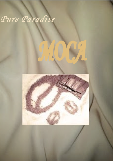
This is the first advertisement that I created. I used Adobe Photoshop firstly to open up the picture of the chocolate and coffee beans to alter the colour using the 'channel mixer' option. I changed its colour by making I have a 'musky' look, bringing out a bold brown colour with lighter shades in other areas. This allows the picture to blend in with the background making it look more appealing to the public. I also used Photoshop to add the background and text. Although, in my design idea for my advert I included the fact that I would have a creamy rippling background, I did this experiment to compare two different ideas. After doing both experiments, I realised that my original idea is better, due to the fact that the background creates a large effect on the positive emotion that it can make people feel when looking at it.
Second experiment (the advert I will use):
Original chocolate photo I took, using my Samsung digital camera:
Second experiment (the advert I will use):
Original chocolate photo I took, using my Samsung digital camera:
Saturday, 5 January 2013
Illustration Page

This is the 'illustration page' that I created on Adobe Illustrator to include in my magazine. I decided to use my research done on Georgina Luck as I appreciate the type of illustration she does, creating particular effects with the watercolours.
My intentions were for this page to be eye-catching and unusual as this page is mainly about the layout. I managed to achieve this by placing each paragraphy 'randomly' on the page and have three of the same bottle (that I drew) across the centre of the page, which is different to what you'd normally see in a magazine because once I seperate the page into two, one of them will be split in half.
Subscribe to:
Posts (Atom)


