 |
| I used this link to create a water ripple effect using Photoshop for my background. I decided to create a water effect as rippled water can be associated with water at the beach e.g: Brighton. Unfortunately I was unsatisfied with the outcome. |
 |
| Colour pallet to help me select colours and textures for my feature page. The three colours on the right are my final choice for the page. |
 |
| As I wasn't satisfied with the water effect I created, I used this image from the internet to add to one side of the page spread. |
 |
| I used the Colour Balance option to adjust the colour to a blue tone so it has a more summer 'feel' of a reflection of the sky, rather than a dirty green colour. |
 |
| I wanted to add another feature of Brighton that could stand out. As my pictures pixilated as I enlarged them, I used this image from the internet. |
 |
| I copied and pasted the image above into Photoshop to make it my own as I got it from the internet. I selected two colours to edit it with; blue and black and used the photocopy option to add an effect. |
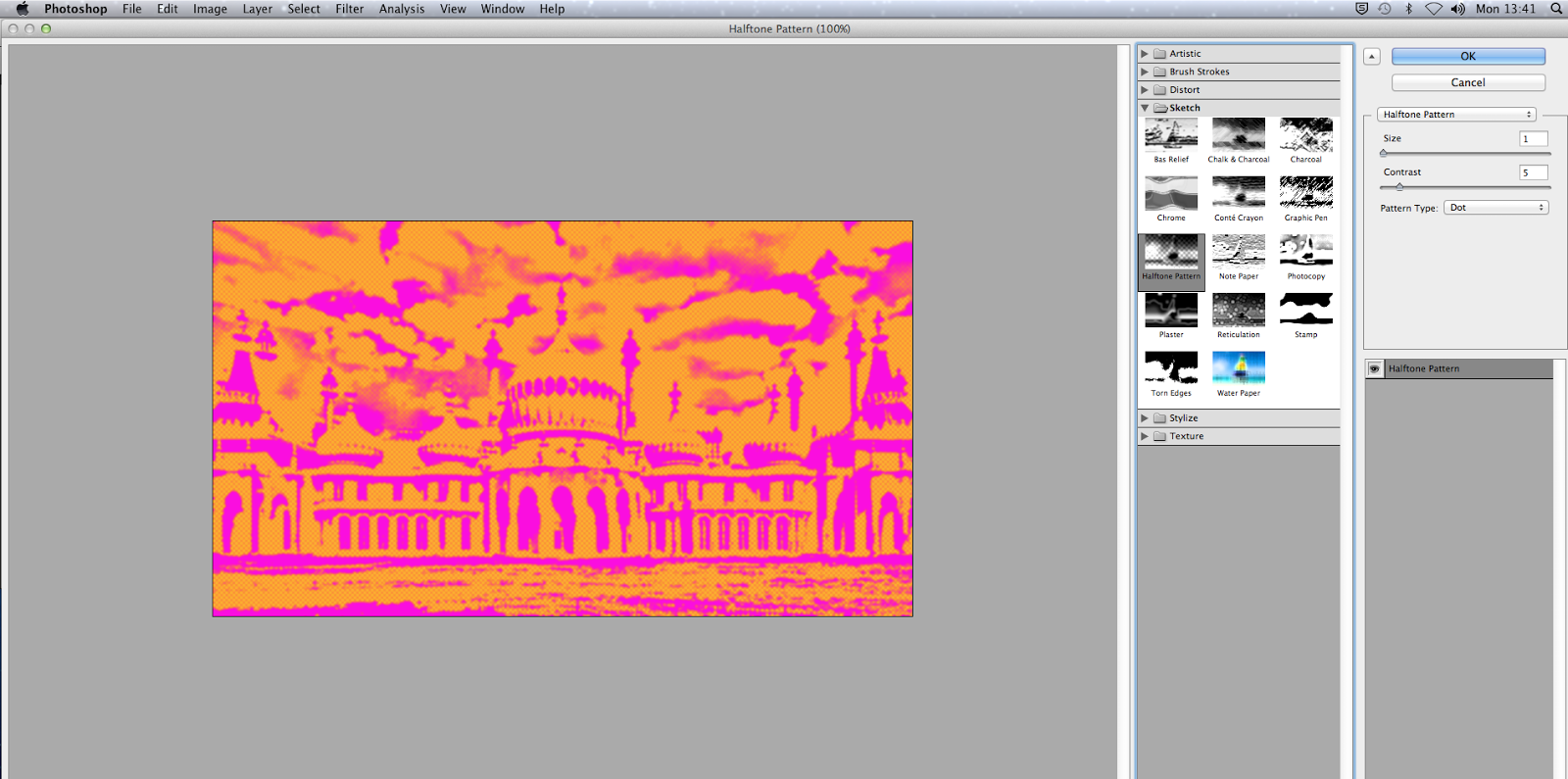 |
| I thought that the image above was slightly dull and wouldn't look as effective on my page spread as I wanted the page to look attractive to all ages. Another one of my intentions was to use colours that are associated with summer according to my research on summer colours on google images. I changed the colours to pink and orange and used the halftone pattern option to create a cartoon-like effect. |
 |
| http://101fundraising.org/2012/07/a-fundraising-checklist-should-you-consider-summer-fundraising/ |
 |
| This is my final feature page spread, with an altered title; pink and orange colours and a different font (Chalkduster) which I used for the other text as well. I chose this font particularly because it reminded me of the texture that is created when using a stick to write words in the sand at a beach. Although this is not a feature at Brighton beach, handmade typography in the sand is associated with summer. I realised this when I researched 'summer' on google images and came across this photo. I placed the water behind the title because I wanted to bring the readers attention to the title, to inform them straight away with an idea of what the page spread is about. I think that has workded successfully due to the fact that I have made the title itself attractive to the eye. I did this by highlighting the fact that alliteration has been used, by using a brigh pink shade for the letter at the beginning of the two words (the letter 'B'). Whereas for the rest of the two words; 'Brilliant' and 'Brighton' I used a bold, bright shade of orange. I chose these two colours and tones in particualr so that they match the picture of the Brighton Pavilion. I didn't want all of the readers attention to go towards the Pavilion therefore I used the same two colours for the title on a background that makes it stand out. |
 |
| After I observed my feature page spread above, I realised that the composition of the pictures didn't symbolise 'summer' as it looked quite dull and uninteresting. I then decided to alter the page spread so that it seemed exciting and able to put teh readers in the mood to go to Brighton. I accomplished this by filling up blank spaces with shells at the top of the page (which i believe you can asscoiate with Brighton as they are collectable at the beach). The purpose of getting rid of blank spaces was done as a visual type of metaphor, symbolising the fact that people sometimes have 'jam-packed' holidays with no time for other plans. I also changed the composition of the four pictures on the right hand side of the page. I chose to place those pictures on teh page creatively, by making them look like Brighton postcards being randomly thrown on the page. |
 |
| I decided to create a 'random' effect after I researched 'postcards' on google images, and appreciated the layout of these cards. |
No comments:
Post a Comment