For this project I was required to design and create CD packaging for a recording artist of my choice. I went about this by firstly brainstorming themes of a particular song by the artist (The Weeknd) and visual elements that he was trying to convey through the use of metaphors for example, with his lyrics. I did this by sketchnoting, writing out the lyrics with images in relation to particular words as well as completing a 'song of the summer' sheet where I wrote down importants messages within the song, the style of the song and the mood it creates. Using these ideas I designed a logo and artwork for the album cover. As the song fit into the R&B genre and was a slow but moving I decided that an italic font would relate best to the recording artist. The first design I created was very bold and included a 'joiner' where the end of the letter 'd' and top of the letter 't' in the name 'The Weeknd' connected to bring across a calm, flowing vibe. Once I had a completed drawn font I then scanned it onto photoshop to manipulate it to make it more interesting, and noticable. I did this by using the gradient tool to blend colours together. I used the gradient tool rather than the paint bucket tool because the gradual blend of the colours created a link to the type of music my chosen recording artist plays. However, I became unsatisfied with the logo due to the heavy weight of each letter, taking away the relation between the font and the music. As a result of this I created a new font. As I wanted to portray a calm, free mood I decided that I would create my new logo design using a free hand and drawing it quickly with no thought, so that the design seemed less 'planned' and formatted. I believe that my new design was a success and has been featured on the interior of the packaging as a repeated pattern. For the rest of the artwork I took my own photos (as shown on my contact sheets) and altered a photo of The Weeknd using photoshop by making it into a silhouette. I took photos of balloons and hands holding wine in a wine glass to relate to the theme of a party as the song is called 'The Party And The After Party'. I edited these photos on photoshop in many ways, for example; using the blending tools, changing the colour to black and white. I also created a mixed media example by blending a digital experiment with a piece of screwed up tissue paper, using photoshop. I chose these types of experiments to relate to the use of metaphors in his song, as well as the image of the party portrayed with the use of the lyrics, involving a possibly confused girl. I also incorporated this theme/idea with the use of my smoke photographs. I believe that these experiments were successful, and therefore used a blending experiment as the background which I added a pale green tone to, to match the logo. I chose this colour because it presents a calm mood, which is a colour used in hospitals for the same purpose. However, I think that I could have explored the use of photography more by photographing more objects, people etc, to take away the simplicity of the artwork, which would not be taken a completely due to the use of the colour and photographs of smoke.
I found this project very enjoyable, and feel that it has allowed me to expand on my skills when using photoshop. It has also allowed me to successfully use a combination of imagery to portray one idea.
Friday, 21 February 2014
Monday, 3 February 2014
Personal Project Evaluation
For my personal project I was
required to submit supporting studies, a linked personal study of
1000-3000 words and practical outcomes from my initial starting points.
At the start of the project, after analysing the brief i came up with four initial ideas that could interlink with my previous project: The CD Packaging Project. The four ideas were: a clothing line, official website for my chosen artist, concert promotion and lastly advertising the launch of a new radio station which is the theme I decided to follow. I made this decision by using the artist (The Weeknd) that I focused my CD Packaging Project on as an overarching theme for this project and thought that it would be interesting to advertise the launch of a new radio station that will have live sessions involving The Weeknd to promote it, using posters as forms of advertisment.
I generated ideas for a logo firstly by researching four logo designs that I found aesthetically interesting. These were for two radio stations: Kiss FM UK and BBC Radio 1, as well as The Ministry Of Sound Logo, which all have been included in my personal study. I enjoyed analysing these logos as it enabled me to understand the use of different logo types for example: wordmarks and combination marks (which is the type that I created in the end). I was very persistent when creating a logo design as I first had to think of a name (which I eventually decided on being 'ease fm' in relation to the music the radio station will play) and then the actual typography which turned out to be bold and italic with a Si Scott inspired design incorporated within it. I went on an interesting journey when developing my logo as i experimented with a variation as I altered the design twice.This is due to the fact that the design I begun with was too bold and seemed mess as the outline for each letter was not straight. I decided it would be best to develop it as the initial design didn't connect to the theme if the word 'ease I did this by drawing sharper letters allowing them to have the same 'x height', and a variation of weight with specific areas of each letter. This development allowed me to eventually express the ideas I aimed to convey (that the music allows you to feel at ease), which was developed even further when I added the Si Scott inspired pattern. I associated Si Scotts typography with the style of music by The Weeknd in particular as the patterns portray a calm mood, representing the idea of going with the flow and these ideas relate to the chosen word for my radio station. Therefore, the use of a combination mark rather than a wordmark conveys my intentional ideas to the public, as well as using a symbol to make the radio station easily recognisable like other radio stations. With the three logo designs that I created as development (as shown in my book) I experimented with photoshop to add a gradient of colour.
Once I had made a decision on the logo I was going to use, I experimented with ideas for the artwork of the poster. I focused on usingg Kandinsky as an inspiration as I appreciated his use of geometric symbols to express his ideas. I thought that it would be interesting to use this idea to visually present the form of music. I did a range of experiments for the artwork, consisting of handmade as well as digital experiments and decided that one digital experiment in particular was the best to use as it clearly related to the theme of slow, calm R&B, indie rock style of music. It presented a galaxy imitation as well as a variation of shapes ranging from circles, to straight lines and swirly lines. When analysing the artwork I believed that I could add more aspects to it relating to music to give it more perspective. I did this by doing Miles Donovan experiments which were not successful to begin with when I used a photoshop tutorial. However I perservered with this idea and used my own techniques to create my own versions of Donovan's style of illustration. For my final outcome I imposed tube station posters and placed my poster on top of existing advertisment. I decided to do this because London is seen as the centre of music as this is where the main radio stations (for example: BBC Radio 1 and Kiss FM UK) are located, therefore I am reaching a wide target audience due to the fact that people transporting from one place to another will be able to see it. I am very satisfied with my outcome as the skewing, rotation, scaling and distortion tools allowed me to fit the poster in perfectly, making the outcomes seem realistic which was my intention.
Tuesday, 28 January 2014
Miles Donovan

These two art pieces were created by an illustrator named Miles Donovan. His work has been used for various clients for editing and advertisments such as: Creative view (as shown above), Newsweek, The New York Times and The Guardian. After looking at his work I was inspired to do my own type of 'Miles Donovan' experiment to add to my poster. I thought this would be interesting as my poster represents 'ease' and these types of images will not take away the meaning as they will add a fun aspect to the poster due to the use of the bright colours. To do this I will take photographs of music appliances and instruments to then adjust and manipulate using Adobe Photoshop to add colours and textures.This photo is one of his illustrations for the cover of 'Creative Review' and I have selected this to analyse as it has inspired me to use his technique for my outcome. I appreciate the use of composition with this artwork because he has created a central focus of the images which makes each aspect as important as each other. This technique conveys an idea that all aspects should be analysed and have purpose. He has also done this by adding vibrant colours (again, creating a sense of importance) and lines to the artwork on a black background with white writing, this allows the images to stand out. I will use this idea when creating my artwork and adding images to it.


The images of the microphone and headphones are my initial Miles Donovan inspired experiments where I used a tutorial on youtube to guide me. However due to the spacing and composition of the objects it was difficult to use the technique. As a result I developed my ideas by using a portrait photo, speakers and mixers I cropped them out of the original photos and placed them onto the background layer of the poster. I then adjusted the brightness and contrast and used the 'soft light' blending tool to blend them with the background. I used this technique to imitate Miles Donovans work. I think that this was more successful than the previous experiments I did as, although I originally intended on having bright colours for the images, I think the use of the blending tool was a better idea as too much colour on the poster would take away the meaning of the radio stations name.
Poster artwork
 |
| Miles Donovan inspired experiment |
 |
| Miles Donovan inspired experiment |


Kandinsky Digital Experiments


I have placed these two images onto my blog as support for the work in my book, as the printing quality effected the images.
Saturday, 14 December 2013
Si Scott; Influential Designer
Si Scott
Si Scott is one of my favourite graphic designers due to the fact that he creates handmade types (my most preferred form of design) of typography to express his views, which is a simple method that he adds great detail to with a combination of flowing patterns and fonts. He is an English graphic designer who was born in Leeds. Si Scott left school at 16 years of age and went to Leeds College Of Art and Design, where he now works as a lecturer. At the College, he studied a BTEC in Graphic Design as well as a foundation in Visual Communication which allowed him to move onto studying a degree in Graphic Design at Birminghamshire Chilterns University. When he completed his degree he stayed in London for 2-3 years where he worked for a number of clients whilst doing his own freelance projects. Over the years he has worked for a number of clients such as Universal Music, Atlantic Records, NYC & GO, Space NK, Contagious, Sony BMG, The Guardian, Nike, Cocoa Cola and Diesel.

This is one of my favourite pieces done by Si Scott. This is due to the fact that he has created an interesting piece using to simple contrasting colours. He has achieved this by adding artwork/patterns to the a phrase, which actually helps bring across the meaning of the phrase, which shows that this was a successful piece. Si Scott's work has inspired me to create a logo in the same style as this example because the patterns around the type help convey a particular mood, which also relates to the style of music my radio station is targeted at; including music by The Weeknd. The main genre that my radio station would supposedly play would be soul (which is the category that The Weeknd's music falls into), R&B and Hip Hop/Rap.
I have chosen to analyse Si Scott because I intend on incorporating his style of design with my typography for the logo I will create for my radio station; 'ease fm'. I have made this decision based on the fact that the music my station will play lies under the genre; slow jams and R&B. This style of music generally has a calm flow, putting you at ease, which is why I chose this particular word for my station. The Si Scott design I will add to it creates a visual connection between the style of music and the name, portraying a theme of tranquility. Although Si Scott incorporates alot of patterns within his typography, I will use a simple design so that the visual aspect of the logo will not take away the meaning of the actua word;'ease'. I can relate this artwork by Si Scott to my potential logo design because the design represents the word use; in this image he has incorporated alot of patterns of swirly lines going in various directions which is a symbolisation of the word; 'spreads'. In contrast to this I will draw a few lines almost as an underline for the typography which is simple and therefore relates to the word 'ease'.
Wednesday, 11 December 2013
BBC Radio 1 - existing example
Unfortuately, towards the start of the launch it was an unpopular radio station and was not satisfying younger generations as much as alternative stations were. This was particularly due to the fact that the station had limited finances as the BBC did not extend the licence fee to fund the radio station. However, despite this, in the mid 70s BBC Radio 1 gained over 10 million listeners and became the most listened to station in the whole world. Radio 1's promotions also helped the stations audience grow massively. These promotions included the BBC Radio Weeks where Radio 1 had its own radshow (Radio 1 Roadshow).

This was the first logo designed for BBC Radio 1 when it was officially established in 1967,which uses a very simple design tehnique due to the era it was created in. I believe that this logo graphically conveys a particular message, this happens through the selected use of the scale of typography; the large 1 is the main focus which simply informs the public of the radio station, I also believe that there is a second meaning to the use of the number 1 which is that this is the number one station in england. I realised this intention as I noticed the fact that there are two number one figures being used; the background shape and in the title within the red rectangle. This emphasis of the number is what portrays this idea of it typically being BBC Radio 1, as well as an intended favourite radio station.

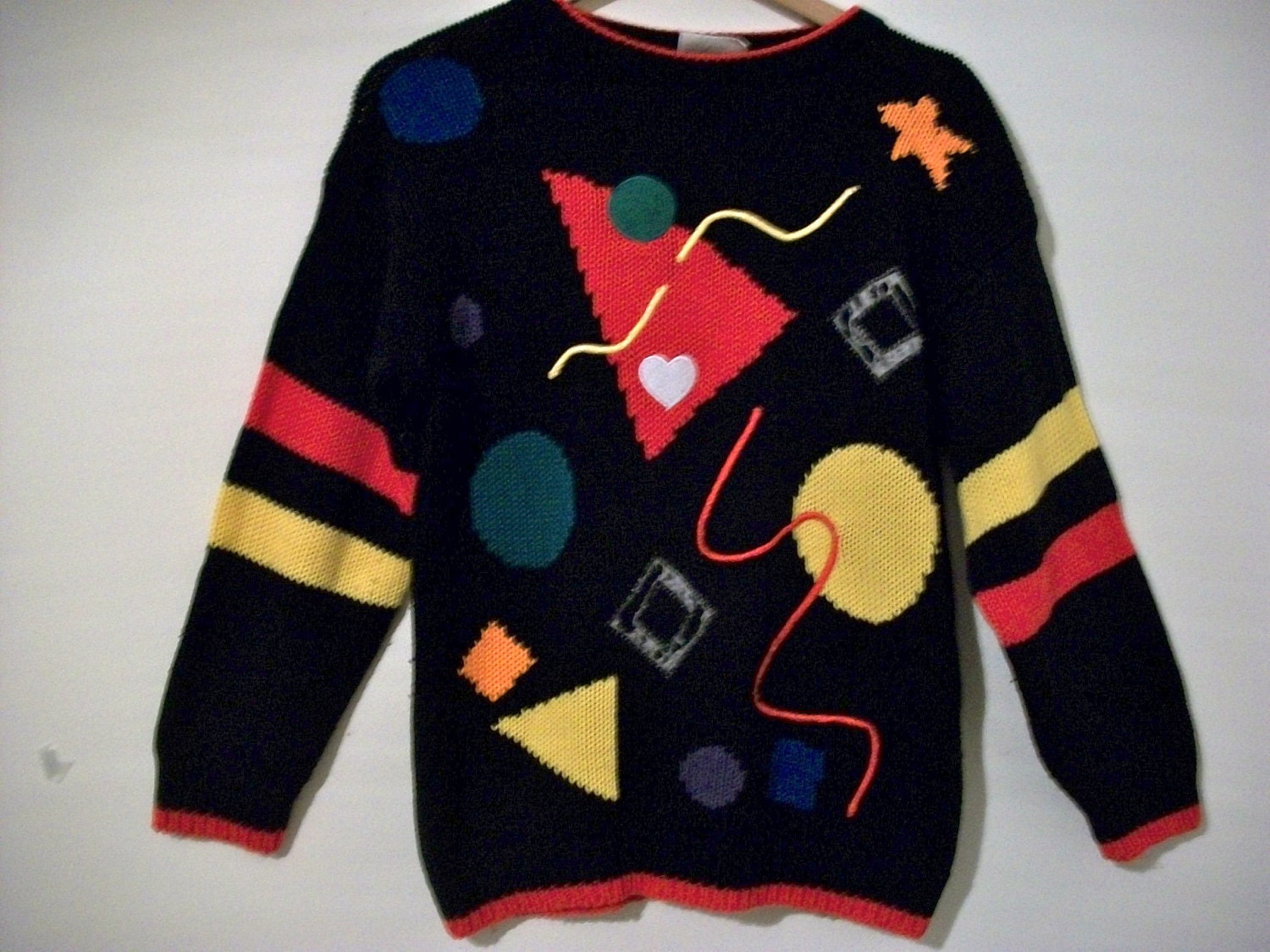
This logo for the radio station was designed in the 90s where there was a rise of multicultralism as various movements spread across the globe such as: grunge, hip hop as well as the 'rave scene', which is why the design is different compared to the previous logo. Although the 90s was the 'time' for a mixture of bright, bold colours and geometric shapes (which I believe is the reason for the choice for the circle) used within one design, for example: clothes (as shown in the photo next to the logo) I believe that the designers of this logo only incorported one main colour, (red) as they had a varied target audience of people of different genders and personalities.
Whilst analysing the BBC Radio 1 logo that was used in the 1990s along with the jumper (which has patterns that I believe inspired the design of the logo) I realised a connection with the art work of Kandinsky.

 These
two pieces of art work were made by the artist: Kandinksy. He is well
known as an influenetial Russian painter, an art theorist as well as one
of the first abstract painter. Kandinsky was influenced by a Russian
occulist; H.P. Blavatsky, known as an exponent of theosophy which is a
theory based on the idea that creation is infact the growth of geometric
shapes. This is expressed through Kandinskys work as he incorporates
ascending and descending circles, lines, triangles and squares.
These
two pieces of art work were made by the artist: Kandinksy. He is well
known as an influenetial Russian painter, an art theorist as well as one
of the first abstract painter. Kandinsky was influenced by a Russian
occulist; H.P. Blavatsky, known as an exponent of theosophy which is a
theory based on the idea that creation is infact the growth of geometric
shapes. This is expressed through Kandinskys work as he incorporates
ascending and descending circles, lines, triangles and squares.
I have decided that I will use this form of artwork for my poster as I believe it is a creative and expressive way to artistically create a connection with the music my radio station will play. This is due to the fact that I am creating a visual form of advertisment and I intend on allowing the public to get a sense of the mood the music will convey, before they listen to the music, this is almost informing them of the genre/s.
I have done a variety of experiments that are place in my sketchbook, but I was mainly inspired by the second image on this page. This is because the colours and the background in particular conveys a starry night sky which portrays a calm mood which is what I plan to do with my art work. The contrasting colours create a sense of a twilight zone, with various sizes of pale toned circles. I inten to use this type of design where I will think carefully about the different sizes of shapes to convey the rhythm of the music; this will include various circle sizes, a lines to represent different stages of the music; small circes: slow beat and singing; larger circles: the climax.

After the 90s, this logo was designed for BBC Radio 1, and is the current logo being used for this station. Although technology has developed, this logo has been designed to be very simple and quite plain. I think that this is due to the fact that the target audience has expanded and therefore the designers have chosen to create something that satisfies all listeners. After observing the other BBC radio logos alongside the one for BBC Radio 1, I have noticed that they all have the same composition of letters, numbers and shapes. This design criteria makes the logo's easily recognisable and highly distinguished from other logos.
Whilst analysing the BBC Radio 1 logo that was used in the 1990s along with the jumper (which has patterns that I believe inspired the design of the logo) I realised a connection with the art work of Kandinsky.
I have decided that I will use this form of artwork for my poster as I believe it is a creative and expressive way to artistically create a connection with the music my radio station will play. This is due to the fact that I am creating a visual form of advertisment and I intend on allowing the public to get a sense of the mood the music will convey, before they listen to the music, this is almost informing them of the genre/s.
I have done a variety of experiments that are place in my sketchbook, but I was mainly inspired by the second image on this page. This is because the colours and the background in particular conveys a starry night sky which portrays a calm mood which is what I plan to do with my art work. The contrasting colours create a sense of a twilight zone, with various sizes of pale toned circles. I inten to use this type of design where I will think carefully about the different sizes of shapes to convey the rhythm of the music; this will include various circle sizes, a lines to represent different stages of the music; small circes: slow beat and singing; larger circles: the climax.
After the 90s, this logo was designed for BBC Radio 1, and is the current logo being used for this station. Although technology has developed, this logo has been designed to be very simple and quite plain. I think that this is due to the fact that the target audience has expanded and therefore the designers have chosen to create something that satisfies all listeners. After observing the other BBC radio logos alongside the one for BBC Radio 1, I have noticed that they all have the same composition of letters, numbers and shapes. This design criteria makes the logo's easily recognisable and highly distinguished from other logos.
Subscribe to:
Posts (Atom)