Unfortuately, towards the start of the launch it was an unpopular radio station and was not satisfying younger generations as much as alternative stations were. This was particularly due to the fact that the station had limited finances as the BBC did not extend the licence fee to fund the radio station. However, despite this, in the mid 70s BBC Radio 1 gained over 10 million listeners and became the most listened to station in the whole world. Radio 1's promotions also helped the stations audience grow massively. These promotions included the BBC Radio Weeks where Radio 1 had its own radshow (Radio 1 Roadshow).

This was the first logo designed for BBC Radio 1 when it was officially established in 1967,which uses a very simple design tehnique due to the era it was created in. I believe that this logo graphically conveys a particular message, this happens through the selected use of the scale of typography; the large 1 is the main focus which simply informs the public of the radio station, I also believe that there is a second meaning to the use of the number 1 which is that this is the number one station in england. I realised this intention as I noticed the fact that there are two number one figures being used; the background shape and in the title within the red rectangle. This emphasis of the number is what portrays this idea of it typically being BBC Radio 1, as well as an intended favourite radio station.

This logo for the radio station was designed in the 90s where there was a rise of multicultralism as various movements spread across the globe such as: grunge, hip hop as well as the 'rave scene', which is why the design is different compared to the previous logo. Although the 90s was the 'time' for a mixture of bright, bold colours and geometric shapes (which I believe is the reason for the choice for the circle) used within one design, for example: clothes (as shown in the photo next to the logo) I believe that the designers of this logo only incorported one main colour, (red) as they had a varied target audience of people of different genders and personalities.
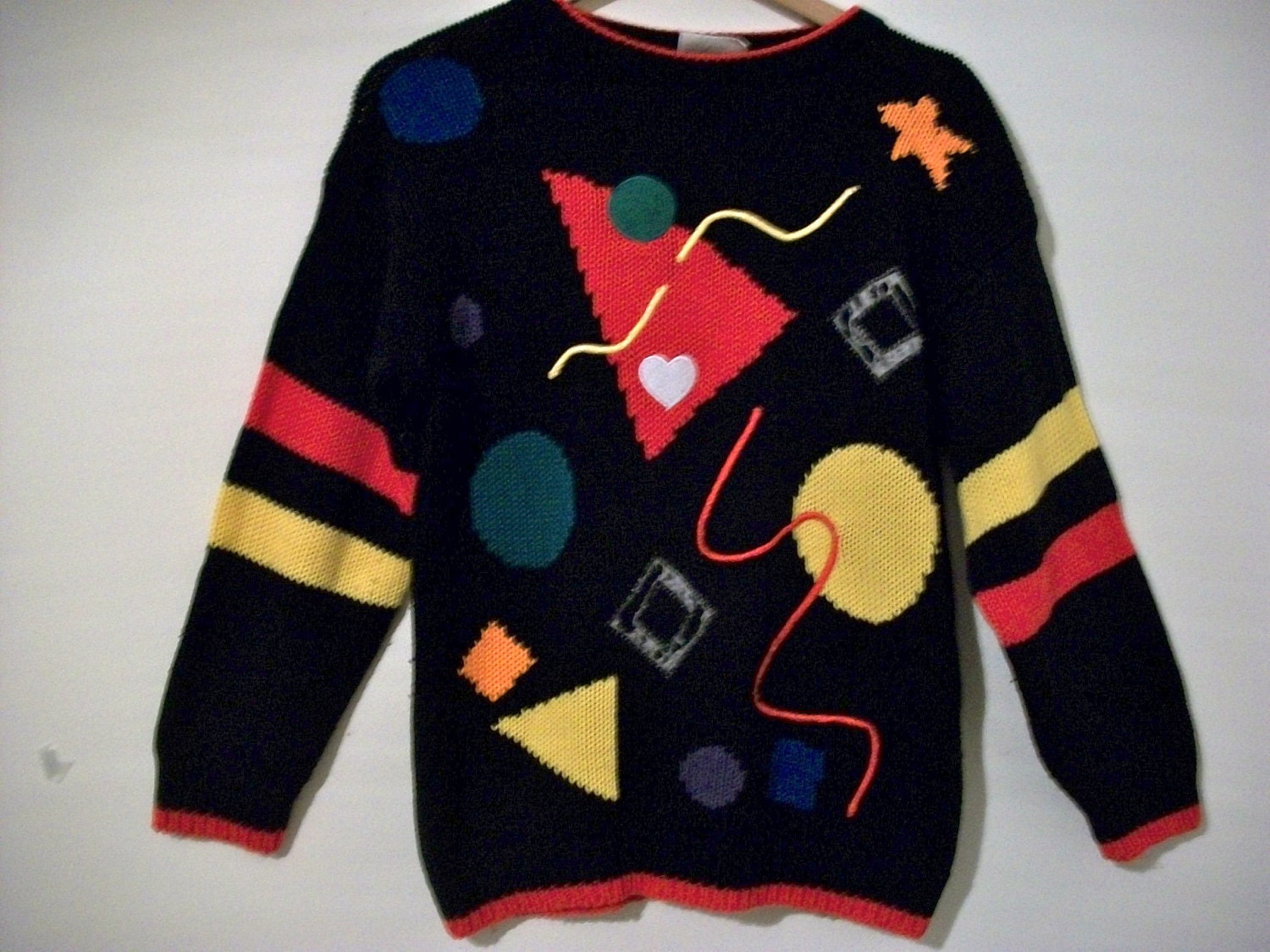
Whilst analysing the BBC Radio 1 logo that was used in the 1990s along with the jumper (which has patterns that I believe inspired the design of the logo) I realised a connection with the art work of Kandinsky.

 These
two pieces of art work were made by the artist: Kandinksy. He is well
known as an influenetial Russian painter, an art theorist as well as one
of the first abstract painter. Kandinsky was influenced by a Russian
occulist; H.P. Blavatsky, known as an exponent of theosophy which is a
theory based on the idea that creation is infact the growth of geometric
shapes. This is expressed through Kandinskys work as he incorporates
ascending and descending circles, lines, triangles and squares.
These
two pieces of art work were made by the artist: Kandinksy. He is well
known as an influenetial Russian painter, an art theorist as well as one
of the first abstract painter. Kandinsky was influenced by a Russian
occulist; H.P. Blavatsky, known as an exponent of theosophy which is a
theory based on the idea that creation is infact the growth of geometric
shapes. This is expressed through Kandinskys work as he incorporates
ascending and descending circles, lines, triangles and squares.
I have decided that I will use this form of artwork for my poster as I believe it is a creative and expressive way to artistically create a connection with the music my radio station will play. This is due to the fact that I am creating a visual form of advertisment and I intend on allowing the public to get a sense of the mood the music will convey, before they listen to the music, this is almost informing them of the genre/s.
I have done a variety of experiments that are place in my sketchbook, but I was mainly inspired by the second image on this page. This is because the colours and the background in particular conveys a starry night sky which portrays a calm mood which is what I plan to do with my art work. The contrasting colours create a sense of a twilight zone, with various sizes of pale toned circles. I inten to use this type of design where I will think carefully about the different sizes of shapes to convey the rhythm of the music; this will include various circle sizes, a lines to represent different stages of the music; small circes: slow beat and singing; larger circles: the climax.

After the 90s, this logo was designed for BBC Radio 1, and is the current logo being used for this station. Although technology has developed, this logo has been designed to be very simple and quite plain. I think that this is due to the fact that the target audience has expanded and therefore the designers have chosen to create something that satisfies all listeners. After observing the other BBC radio logos alongside the one for BBC Radio 1, I have noticed that they all have the same composition of letters, numbers and shapes. This design criteria makes the logo's easily recognisable and highly distinguished from other logos.
Whilst analysing the BBC Radio 1 logo that was used in the 1990s along with the jumper (which has patterns that I believe inspired the design of the logo) I realised a connection with the art work of Kandinsky.
I have decided that I will use this form of artwork for my poster as I believe it is a creative and expressive way to artistically create a connection with the music my radio station will play. This is due to the fact that I am creating a visual form of advertisment and I intend on allowing the public to get a sense of the mood the music will convey, before they listen to the music, this is almost informing them of the genre/s.
I have done a variety of experiments that are place in my sketchbook, but I was mainly inspired by the second image on this page. This is because the colours and the background in particular conveys a starry night sky which portrays a calm mood which is what I plan to do with my art work. The contrasting colours create a sense of a twilight zone, with various sizes of pale toned circles. I inten to use this type of design where I will think carefully about the different sizes of shapes to convey the rhythm of the music; this will include various circle sizes, a lines to represent different stages of the music; small circes: slow beat and singing; larger circles: the climax.
After the 90s, this logo was designed for BBC Radio 1, and is the current logo being used for this station. Although technology has developed, this logo has been designed to be very simple and quite plain. I think that this is due to the fact that the target audience has expanded and therefore the designers have chosen to create something that satisfies all listeners. After observing the other BBC radio logos alongside the one for BBC Radio 1, I have noticed that they all have the same composition of letters, numbers and shapes. This design criteria makes the logo's easily recognisable and highly distinguished from other logos.
No comments:
Post a Comment