Saturday, 14 December 2013

Si Scott; Influential Designer

Si Scott

Si Scott is one of my favourite graphic designers due to the fact that he creates handmade types (my most preferred form of design) of typography to express his views, which is a simple method that he adds great detail to with a combination of flowing patterns and fonts. He is an English graphic designer who was born in Leeds. Si Scott left school at 16 years of age and went to Leeds College Of Art and Design, where he now works as a lecturer. At the College, he studied a BTEC in Graphic Design as well as a foundation in Visual Communication which allowed him to move onto studying a degree in Graphic Design at Birminghamshire Chilterns University. When he completed his degree he stayed in London for 2-3 years where he worked for a number of clients whilst doing his own freelance projects. Over the years he has worked for a number of clients such as   Universal Music, Atlantic Records, NYC & GO, Space NK, Contagious, Sony BMG, The Guardian, Nike, Cocoa Cola and Diesel. 


This is one of my favourite pieces done by Si Scott. This is due to the fact that he has created an interesting piece using to simple contrasting colours. He has achieved this by adding artwork/patterns to the a phrase, which actually helps bring across the meaning of the phrase, which shows that this was a successful piece. Si Scott's work has inspired me to create a logo in the same style as this example because the patterns around the type help convey a particular mood, which also relates to the style of music my radio station is targeted at; including music by The Weeknd. The main genre that my radio station would supposedly play would be soul (which is the category that The Weeknd's music falls into), R&B and Hip Hop/Rap.

I have chosen to analyse Si Scott because I intend on incorporating his style of design with my typography for the logo I will create for my radio station; 'ease fm'. I have made this decision based on the fact that the music my station will play lies under the genre; slow jams and R&B. This style of music generally has a calm flow, putting you at ease, which is why I chose this particular word for my station. The Si Scott design I will add to it creates a visual connection between the style of music and the name, portraying a theme of tranquility. Although Si Scott incorporates alot of patterns within his typography, I will use a simple design so that the visual aspect of the logo will not take away the meaning of the actua word;'ease'. I can relate this artwork by Si Scott to my potential logo design because the design represents the word use; in this image he has incorporated alot of patterns of swirly lines going in various directions which is a symbolisation of the word; 'spreads'. In contrast to this I will draw a few lines almost as an underline for the typography which is simple and therefore relates to the word 'ease'.

Wednesday, 11 December 2013

BBC Radio 1 - existing example

This British radio station is operated by the BBC (British Broadcasting Corporation), and focuses on chart hits as well as general popular songs within that period of time. It has been said that their target audience is the 15-29 age group. This station was established in 1967,where DJ Tony Blackburn was the first to broadcast on the new station, who was able to host the 'prime slot'; Radio 1 Breakfast Show. Throughout his shows he was the first presenter within the BBC to play music by American artists (which is what my station will suposedly play), which was to catch the attention of the audience as most people were already familiar with this style of music due to it being played on pirate stations by various DJs. When this radio station launched, it consisted of a variety of DJs, such as: Tommy Vence, Pete Murray, John Peel, Simon Dee, Annie Nightingale (Britains first female DJ) and many others. 

Unfortuately, towards the start of the launch it was an unpopular radio station and was not satisfying younger generations as much as alternative stations were. This was particularly due to the fact that the station had limited finances as the BBC did not extend the licence fee to fund the radio station. However, despite this, in the mid 70s BBC Radio 1 gained over 10 million listeners and became the most listened to station in the whole world. Radio 1's promotions also helped the stations audience grow massively. These promotions included the BBC Radio Weeks where Radio 1 had its own radshow (Radio 1 Roadshow).


This was the first logo designed for BBC Radio 1 when it was officially established in 1967,which uses a very simple design tehnique due to the era it was created in. I believe that this logo graphically conveys a particular message, this happens through the selected use of the scale of typography; the large 1 is the main focus which simply informs the public of the radio station, I also believe that there is a second meaning to the use of the number 1 which is that this is the number one station in england. I realised this intention as I noticed the fact that there are two number one figures being used; the background shape and in the title within the red rectangle. This emphasis of the number is what portrays this idea of it typically being BBC Radio 1, as well as an intended favourite radio station. 

 
This logo for the radio station was designed in the 90s where there was a rise of multicultralism as various movements spread across the globe such as: grunge, hip hop as well as the 'rave scene', which is why the design is different compared to the previous logo. Although the 90s was the 'time' for a mixture of bright, bold colours and geometric shapes (which I believe is the reason for the choice for the circle) used within one design, for example: clothes (as shown in the photo next to the logo) I believe that the designers of this logo only incorported one main colour, (red) as they had a varied target audience of people of different genders and personalities. 

Whilst analysing the BBC Radio 1 logo that was used in the 1990s along with the jumper (which has patterns that I believe inspired the design of the logo) I realised a connection with the art work of Kandinsky.


These two pieces of art work were made by the artist: Kandinksy. He is well known as an influenetial Russian painter, an art theorist as well as one of the first abstract painter. Kandinsky was influenced by a Russian occulist; H.P. Blavatsky, known as an exponent of theosophy which is a theory based on the idea that creation is infact the growth of geometric shapes. This is expressed through Kandinskys work as he incorporates ascending and descending circles, lines, triangles and squares.

I have decided that I will use this form of artwork for my poster as I believe it is a creative and expressive way to artistically create a connection with the music my radio station will play. This is due to the fact that I am creating a visual form of advertisment and I intend on allowing the public to get a sense of the mood the music will convey, before they listen to the music, this is almost informing them of the genre/s. 

I have done a variety of experiments that are place in my sketchbook, but I was mainly inspired by the second image on this page. This is because the colours and the background in particular conveys a starry night sky which portrays a calm mood which is what I plan to do with my art work. The contrasting colours create a sense of a twilight zone, with various sizes of pale toned circles. I inten to use this type of design where I will think carefully about the different sizes of shapes to convey the rhythm of the music; this will include various circle sizes, a lines to represent different stages of the music; small circes: slow beat and singing; larger circles: the climax.


After the 90s, this logo was designed for BBC Radio 1, and is the current logo being used for this station. Although technology has developed, this logo has been designed to be very simple and quite plain. I think that this is due to the fact that the target audience has expanded and therefore the designers have chosen to create something that satisfies all listeners. After observing the other BBC radio logos alongside the one for BBC Radio 1, I have noticed that they all have the same composition of letters, numbers and shapes. This design criteria makes the logo's easily recognisable and highly distinguished from other logos. 

Kiss FM UK- existing example

Kiss FM is a radio station that is a part of the Bauer Passion portfolio and specialises in hip hop, R&B, pop, urban and house music, broadcasting on FM and National DAB. This station also has digtal broadcasts on DAB Digital Radio, Freeview, Sky, and TalkTalk TV.

Kiss FM started in October 1985, broadcasting only to South London, and then expanded over the whole city on 94 FM. The audience for Kiss grew in 1990 when it 
achived a licence. It has been said that it had 500,000 listeners when operating as a pirate station, with no licence. This station was published by Gordon Mcnamee, Tosca, Pyers Easton and George Power. Kiss FM used a launch of a party theme: 'Kiss Nights' at the Wag Club with the help of a London Club promoter: Guy Wingate. This relates to my personal project as I am using a different form of music to promote my new radio station; live sessions. In 1998 the station was rebranded and the logo was officially changed in 1999. In 2006 there was a second revamp of the brand where ODD designed the new logo. At the launch of this logo the radio station begun to focus on one genre in particular which was dance music.ODD which is a group of people that specialise in a number of things; identity design, brand relaunches, event design curation, visual merchandising, etc.. This brand opened in 2002 and since the launch they have worked with a variety of clients such as: Westfield, ASOS, Nike, Vodafone, Uniqlo, Sony etc.. The ODD brand was launched by a man who is now the creative director of the brand, and is named Nick Stickland. He is a graduate of Architecture from Royal College of Art. He begun his career by working for other architects such as: Eva Jiricna, Richard Rogers, ORMS and FAT. After searching for a compay that specialised in design and communications, he decided to create his own in 2002. 


1990-1998


This logo reminds me of the BBC Radio 1 logo that was designed for the 90s due to the fact that they have both been made for that particular era which is obvious due to the use of bright colours. However the shapes in this logo have been used differently compared to the BBC Radio 1, as this logo uses a symbol/icon. This type of logo represents the radio station visually and creates a direct link between the company name and imagery. I think that the reason for this choice of logo was made as it makes the station highly recognisable to the public from various view points, for example: being far away from the logo where the typography is unclear, but the shape of the logo is still visible which is also supported by the use of the bright colour.


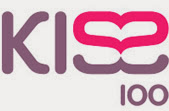
1998-2006
This modification of the Kiss 100 logo uses lettermarks rather than a symbol, but has been creatively designed using typography to add imagery to the logo, which also links to the name of the station, like the logo above. A lettermark form of logo usually uses a symbol that represents the company using its initials or the first letter of the company, whereas kiss have cleverly incorporated this logo type with the last two letters of the brand name by turning the second 's' around and merging it with the first 's' to create a heart shape which is what people would associate with the word 'kiss'. This association with the word 'kiss' has also been thought about regarding the choice of colour as the colour palet for this logo revolves around shades of pink and purple, which is commonly linked to the name of this radio station.


 This logo is the design that has been used by the radio station since 2006 to now. It has evolved from using symbols relating to the name of the company, to the use of this large dynamic shape with points in various directions. I think that the purpose of this was to visually convey the idea that this radio station plays music of a variety of genres (even though it has a main focus; pop) and therefore connects to a wide range of people within an audience. Although this station now uses a ‘combination mark’ type of logo rather than a lettermark or symbol type, the use of a colour relating to the name is still present. A combination mark is a type of logo that combines a symbol with typography.