Sunday, 30 September 2012

Vladimir Konca; Experimental Typography

Beans Type:


This is my favourite piece of work done by Vladimir Konca. This is due to the fact that the phrase and the objects used to create the phrase actually mean something to Vladimir. The beans (which are always growing) represent his 'ever growing handmade typography project called Diary Type'. I believe that the phrase he created with the beans is his explanation for his on-going handmade typography.

He has explained that 'Diary Type' is a personal diary that Vladimir Konca made as an experiment for his typography in 2007. For each page in the diary he would collect objects and make a letter out of them, from that he would spell out his thoughts which have a  symbolic link with the fonts and the way the objects reflected on his thoughts.

Experimental Typography

Throughout this lesson we had to experiment different typography with different foods. Whilst thinking of a word/phrase to spell out with the food, we had to think of a word/phrase that had some sort of relation to the food we were using. For example: when using salt, we wrote the phrase 'Uh-Oh!' as a response to the common phrase: 'You get bad luck if you spill salt'.


This is the first experiment that my group did using plain dry rice. We used our fingers carefully shaping the same font with each letter allowing the word to look simple but fun. We chose to write the word pudding because it relates to the food Rice Pudding. The image we created shows a play on words using an object; the actual rice represents the rice in the pudding.


This is the second experiment that we did which I found the easiest. This is because Alphabetti Spaghetti reminded us all of our childhood, and how we used to play with the food and spell out words. From those thoughts we decided to create a phrase that basically sums up fun of Alphabetti Spaghetti.


This is the third experiment that we did using beans. This word simply relates to the well known phrase 'the more you eat the more you fart'. We added the squiggly at the bottom and either side of the word to create imagery of the word.     


This is the fourth experiment that we did using Penne pasta. We aslo found this quite easy to do because we just thought about where the food originates from; Italy. To make it seem interesting we decided to spell 'Italy' in Italian, rather than in English like the rest of our experiments.We wrote it in this font because it resembles the 'extravagant' that belong to culture of italy.


This is the fitth experiment we did using spaghetti. We decided to write the word 'Carbs' because it simply tells you what spaghetti is. Due to the fact that we used a really blunt word, we decided to write the word in the same way.


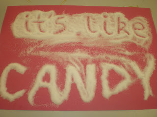
This is the fith experiment that we did which is one of my favourites. This is because its the lyrics of a song and relates to the actual substance that we used; sugar.
                                   

This is the sixth experiment that we did which is ultimately my favourite. This because its quite conceptual; the phrase relates to another phrase which is 'You get bad luck if you spill salt', and the thought cloud represents peoples thoughts after spilling the salt. 


This is the seventh and last experiment that we did using ketchup. It was quite easy for us to think of this phrase as we remebered one of Burger Kings phrases which is; 'Have It Your Way' which involves tomato ketchup.


Hennie Haworth

Hennie Haworth 
Hennie Haworth graduated from Brighton University in 2004 and now works and lives in London doing freelance illustrations. She has a wide range of clients, including: Waitrose, Sony Eriksson, Penguin, Guardian, Habitat, Elle Magazine, Marc Jacobs, W&K and ENI. 
In 2010 she travelled to Japan to do some personal drawing projects. During her time there she also collaborated with a Japanese company called The Link Collective to design a traditional folding cloth, which is known as a Furoshiki. The following year she took part in an illustration exhibition in Stockholm. 
Hennie Haworth's illustrations:

Waitrose Rock

Guardian
Wish Magazine V

You're The One For Me Fatty 


James Hancock

James Hancock's obsession with drawing everything in the world at least once is what has made him famous. It has brought him to do many major prints for example: TV and music publishing releases. He also done many projects in various countries around the world; the USA, the UK, Australia, Germany, Indonesia, France and Austria.

When he was in kindergarten in Sydney, Australia, his obessive behaviour was clearly shown when he painted the most complicated picture he could think of, and wouldn't move onto the next activity. This was because instead, he decided to draw an extremely detailed drawing of a city of houses.

During his time at school, he discovered technical drawing. The tool he most enjoyed using for his drawings was the mechanical pencil. This is due to the fact that the size of the lead could change from .25, .5 and .3 thickness. When he realised that he could perfectly visualize 3D images in his head, it drove him to continue drawing them and exploring different ways to draw things. Over the years his work has developed to having philosophical and conceptual meaning.

After his graduation with the University Medal and Honurs, he begun a gallery in Sydney with three of his friends. The gallery was called SPACE3 where local artists placed their work to exhibit.
 

James Hancocks art:


http://poolga.com/poolga/james-gulliver-hancock-pipes


Sunday, 23 September 2012

Hand Drawn Typography


These are my first three pieces of hand drawn typography. I was inspired by Henni Haworth and James Hancock.


Wednesday, 12 September 2012